

conjure: wrap-up
PRODUCT / UI / UX
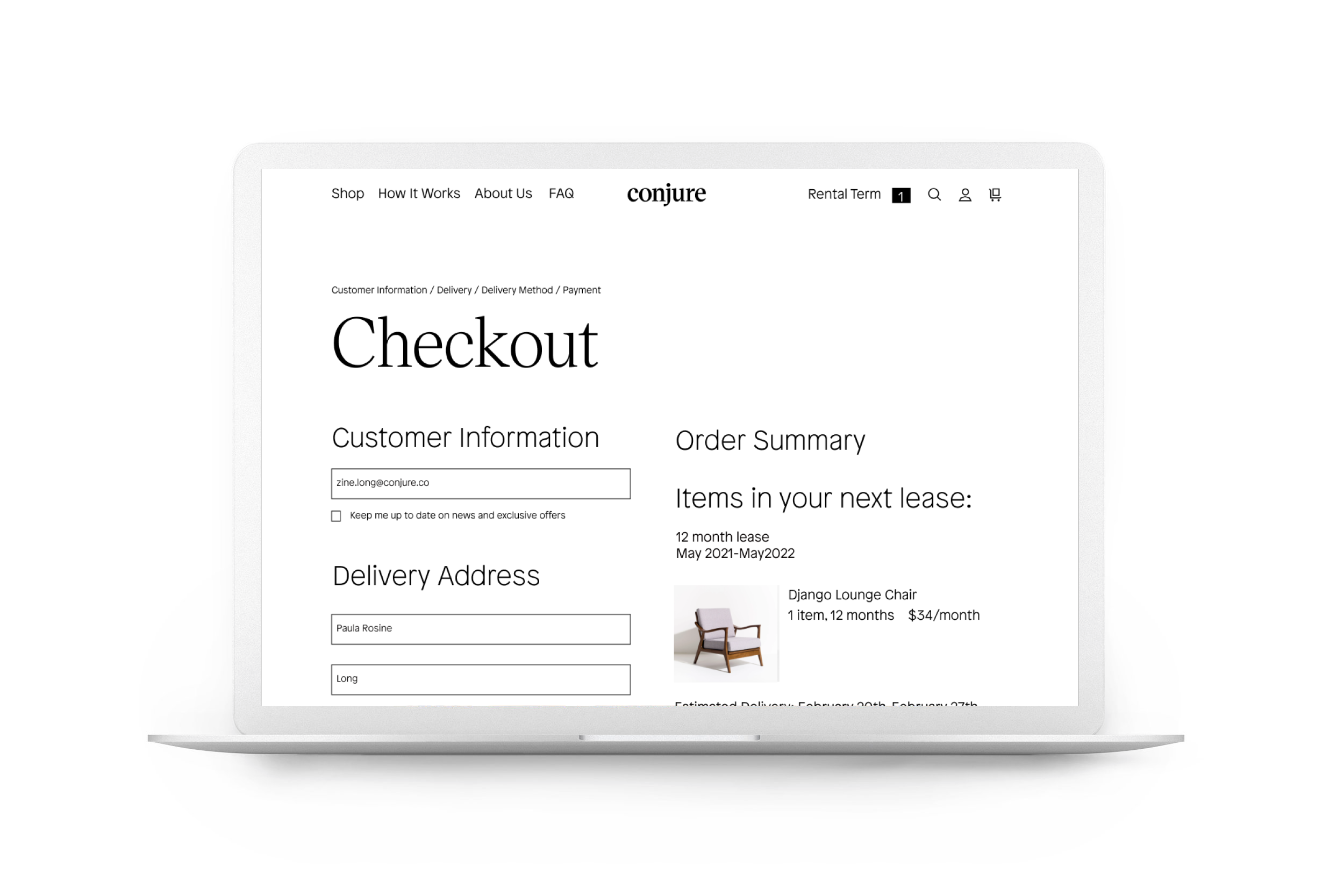
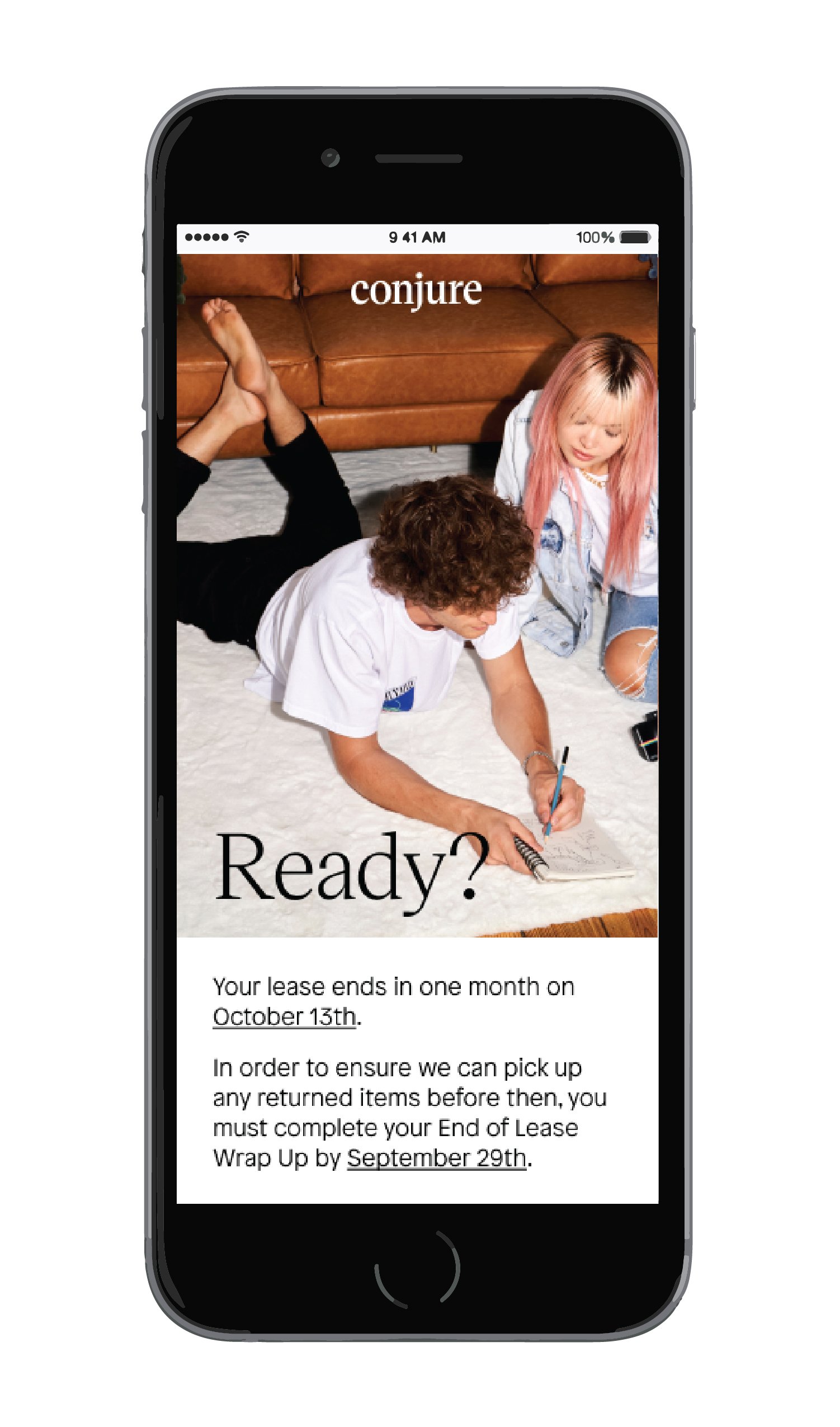
One of my favorite products we designed at Conjure is the End of Lease Wrap-Up. Due to rapid growth, we quickly approached more customers reaching the end of a lease than CX could manually handle. The wrap-up product we created was the first step toward greater automation. By allowing users to wrap up their lease in their account page, we could reduce human error, improve customer history records, and gather data more easily. This product would also serve to better educate our customers about our policies and the decisions open to them at the end of each lease. (Shout out to PM Lauren Evans and Engineer lead Eugene Kagan for their awesome work in helping get this project to fruition.)
CHALLENGES:
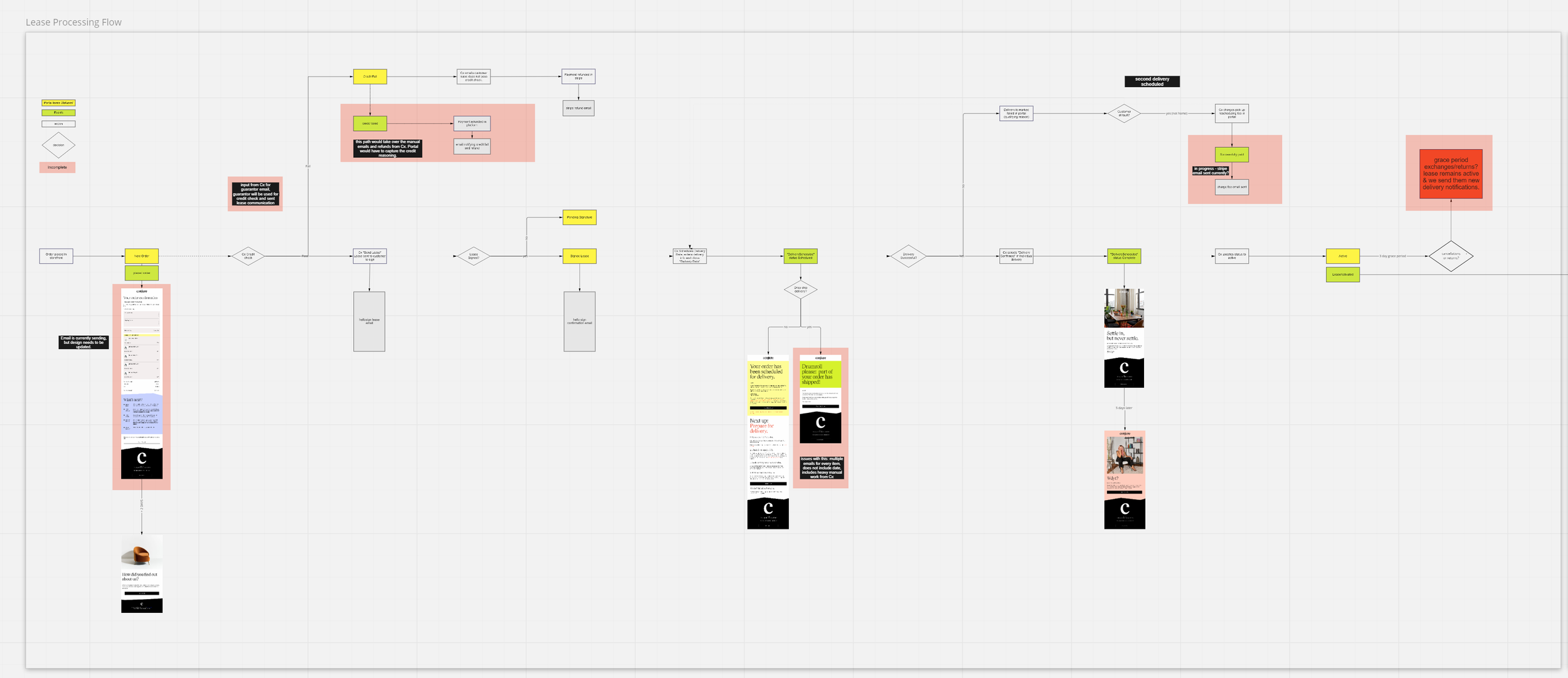
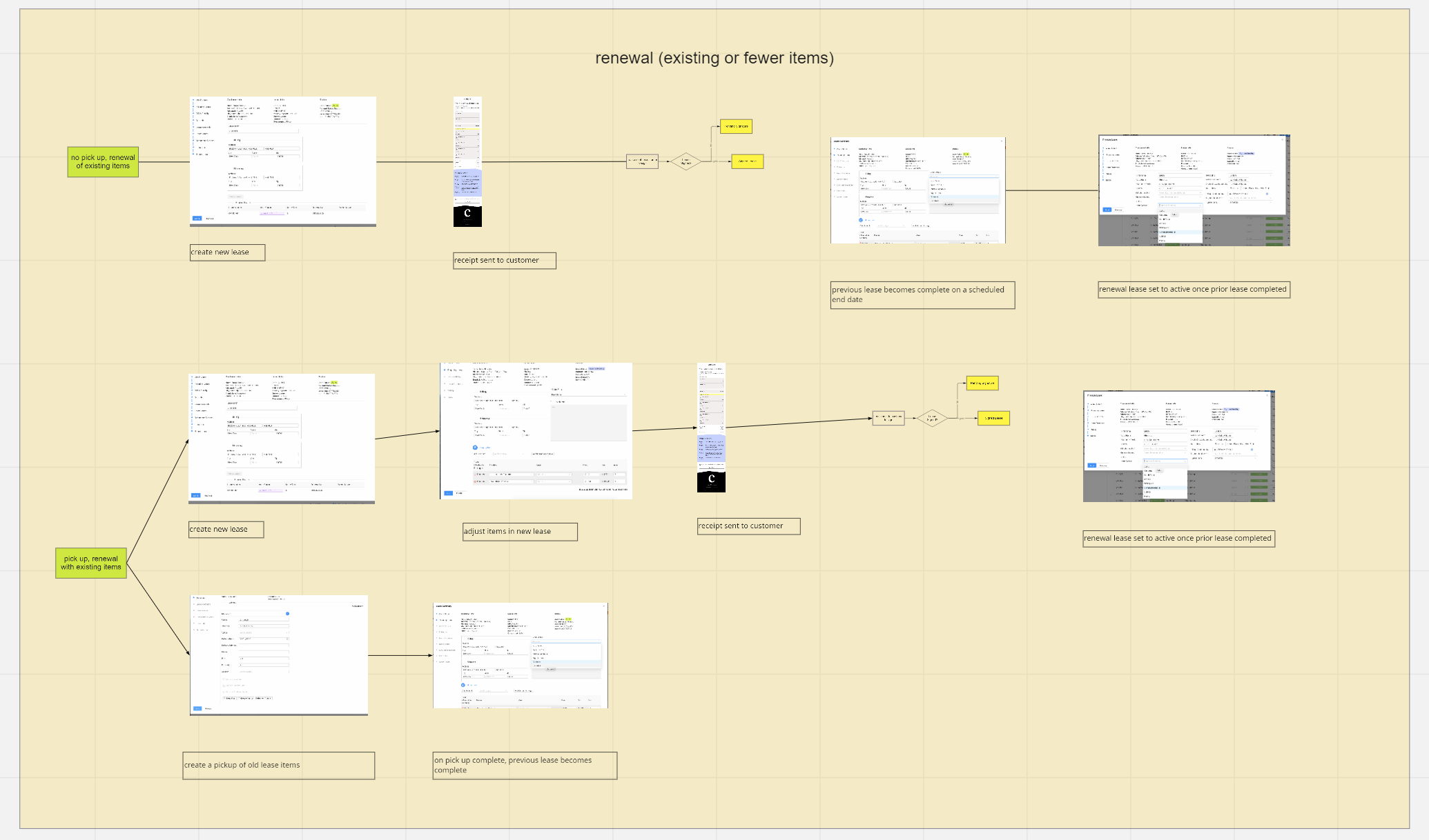
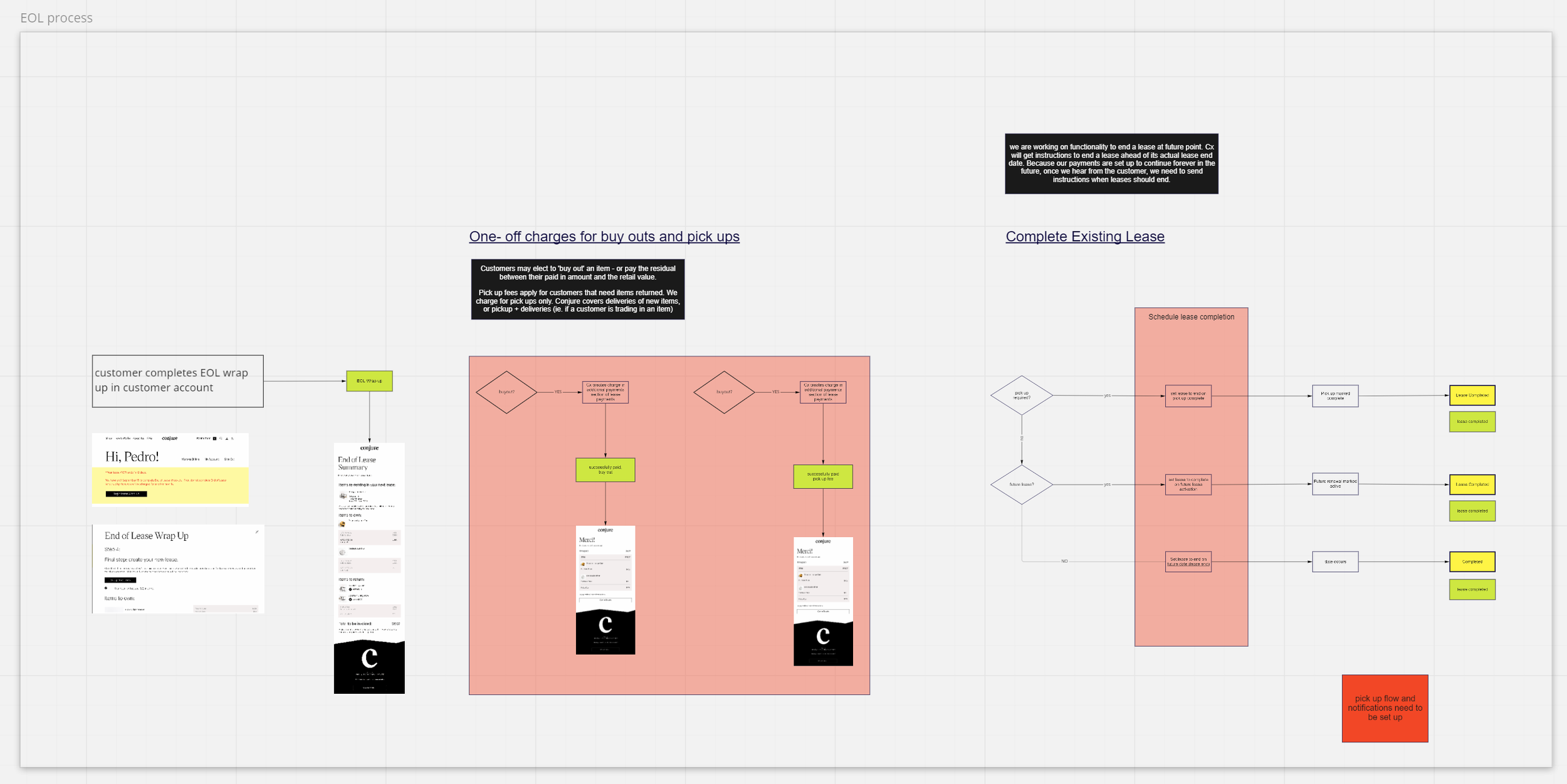
Below image shows decision tree that I created to keep track of all possible decision outcomes for a customer within company policy. Even excluding decisions related to using rewards/discounts, there are 144 possible outcomes for a user. A key challenge of this project was this complexity. We wanted to create something that would break decisions down in a way that was easy to use, but wouldn’t give the user choice overload. Another challenge was the need to prioritize features heavily in order to get a good-enough version live ASAP to relieve our CX team.

PROCESS:
I quickly sketched out different options, thinking through what would be the most efficient way for the customer to make the necessary decisions, using the smallest number of screens and clicks.
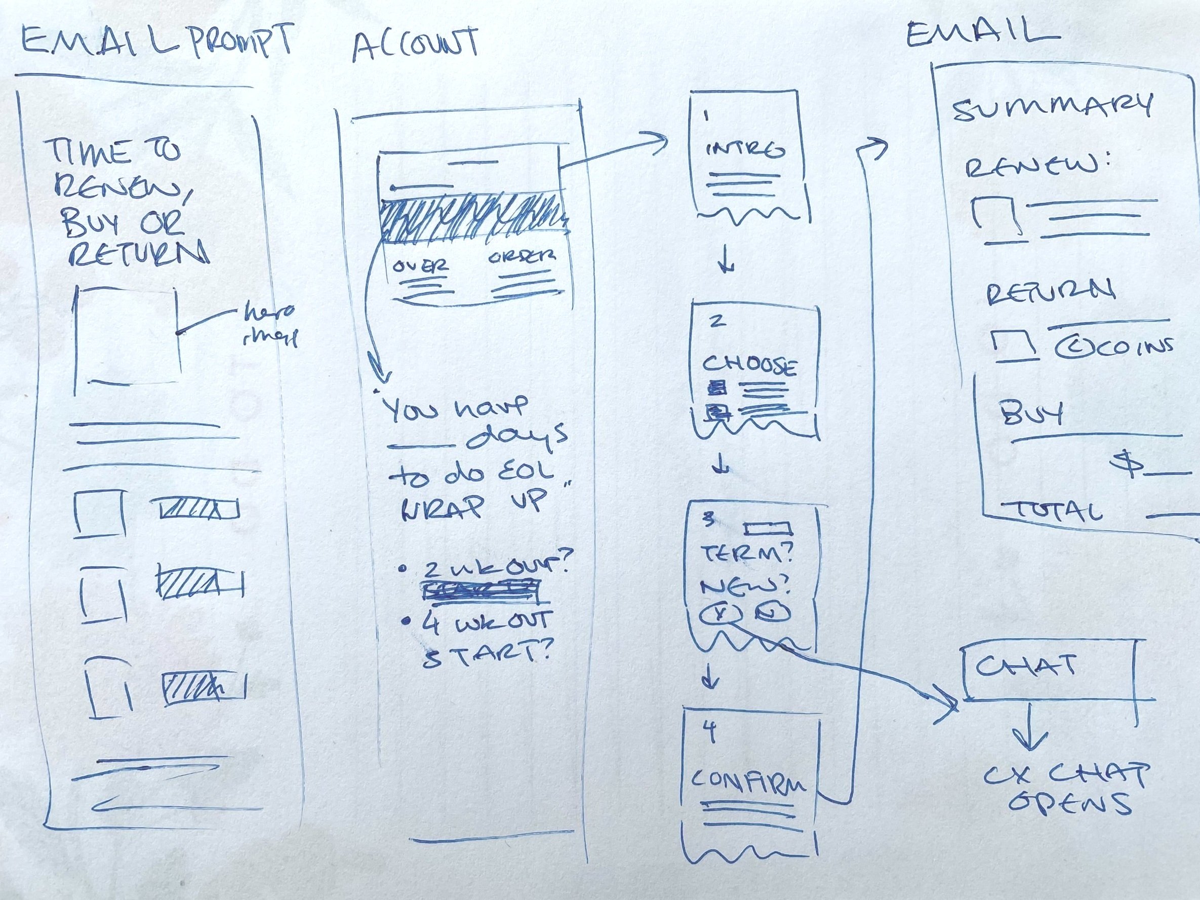
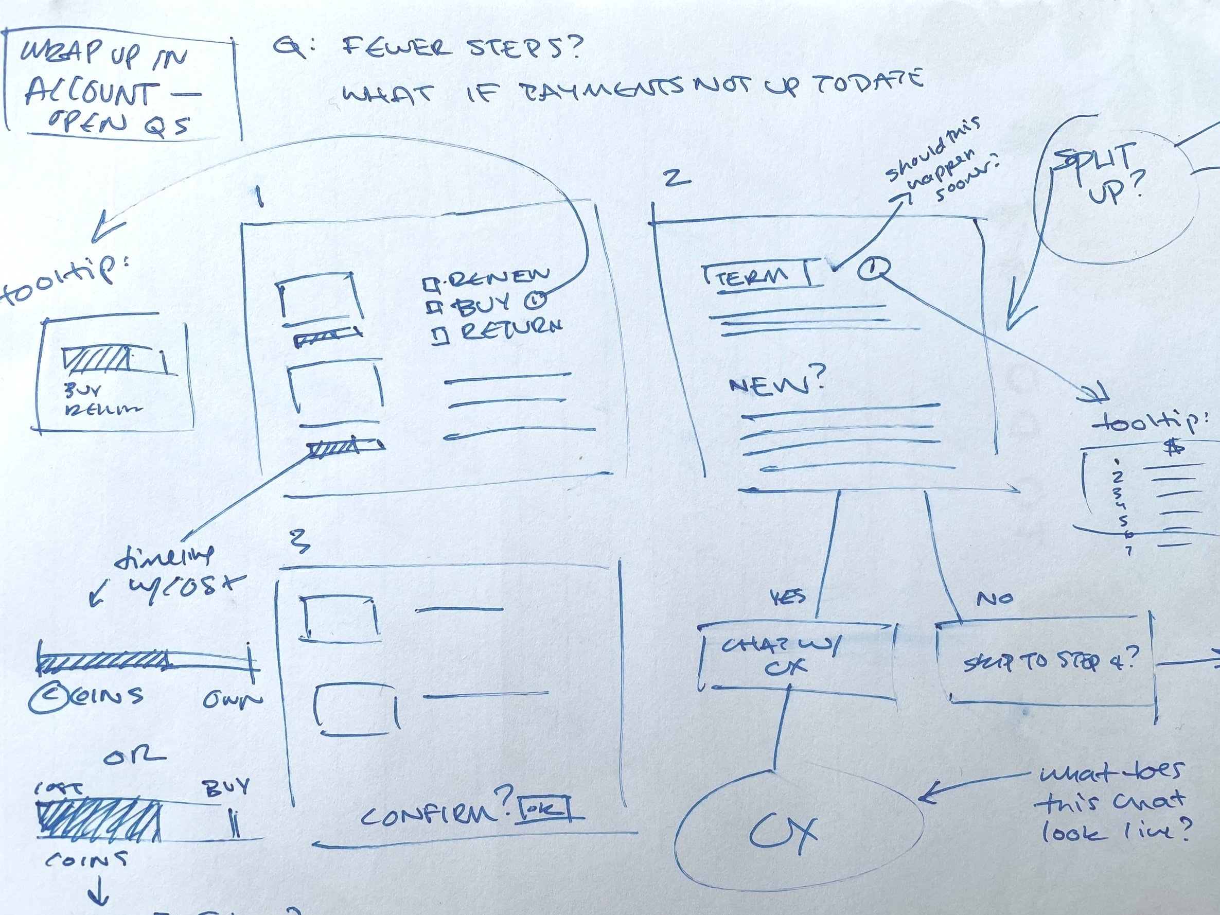
I worked with our PM to plan out the UX logic in Miro for the end of lease wrap up in the customer account as it related to 1) emails sent to customer along this part of the user journey and 2) internal tools, i.e. how inputs would appear to CX and data would be gathered.
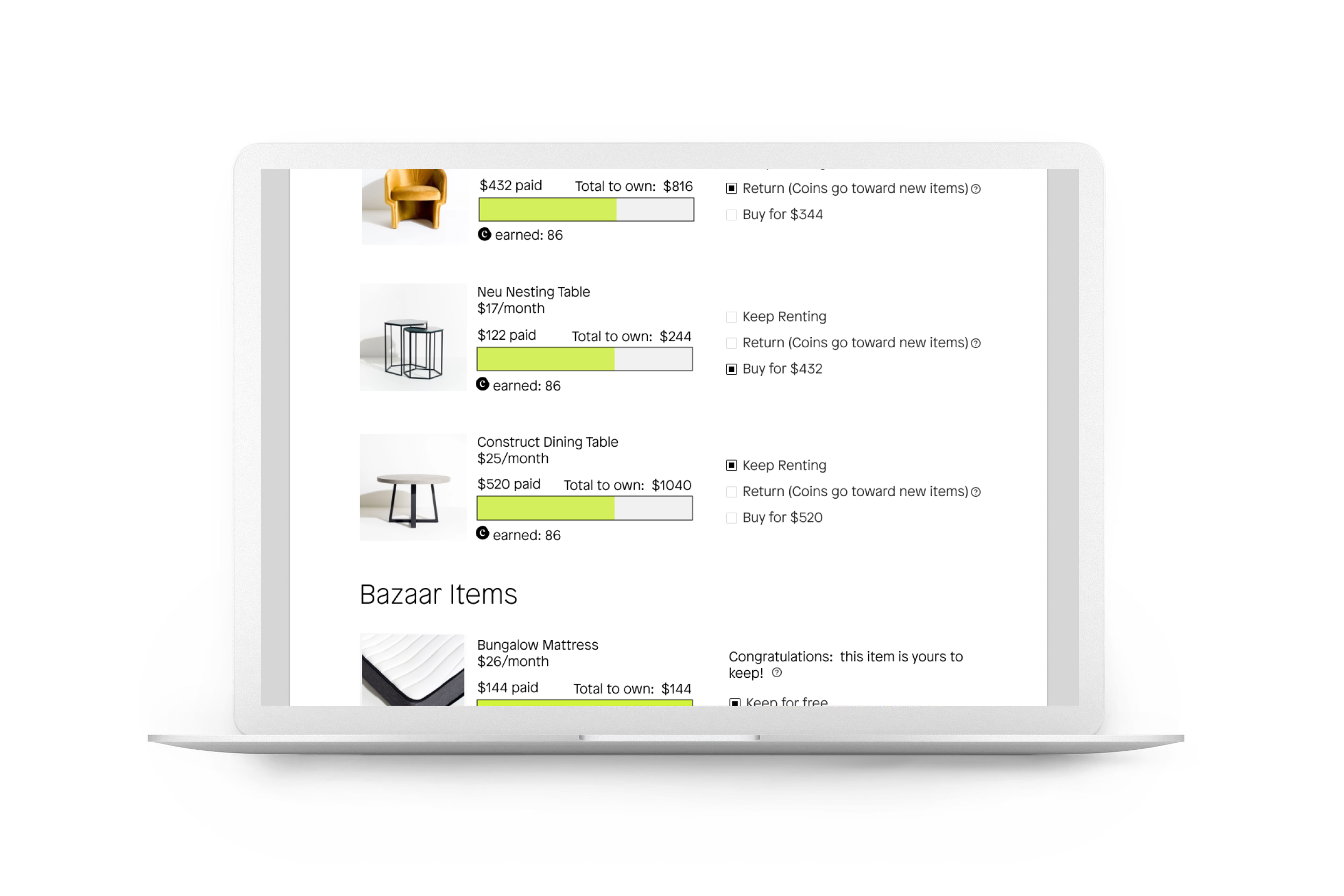
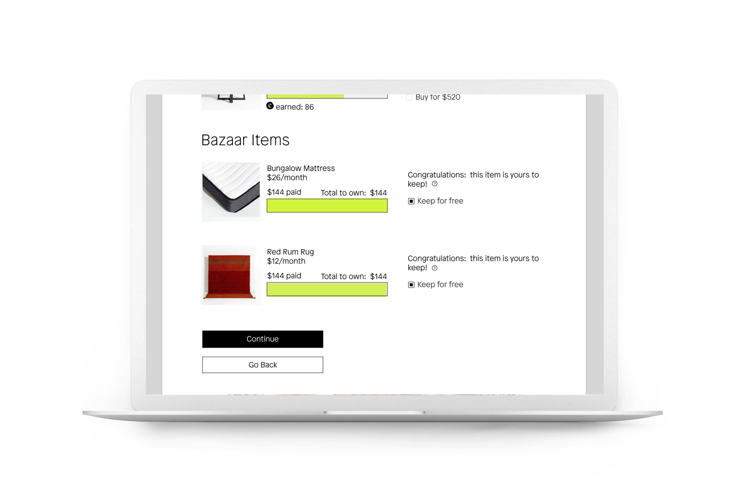
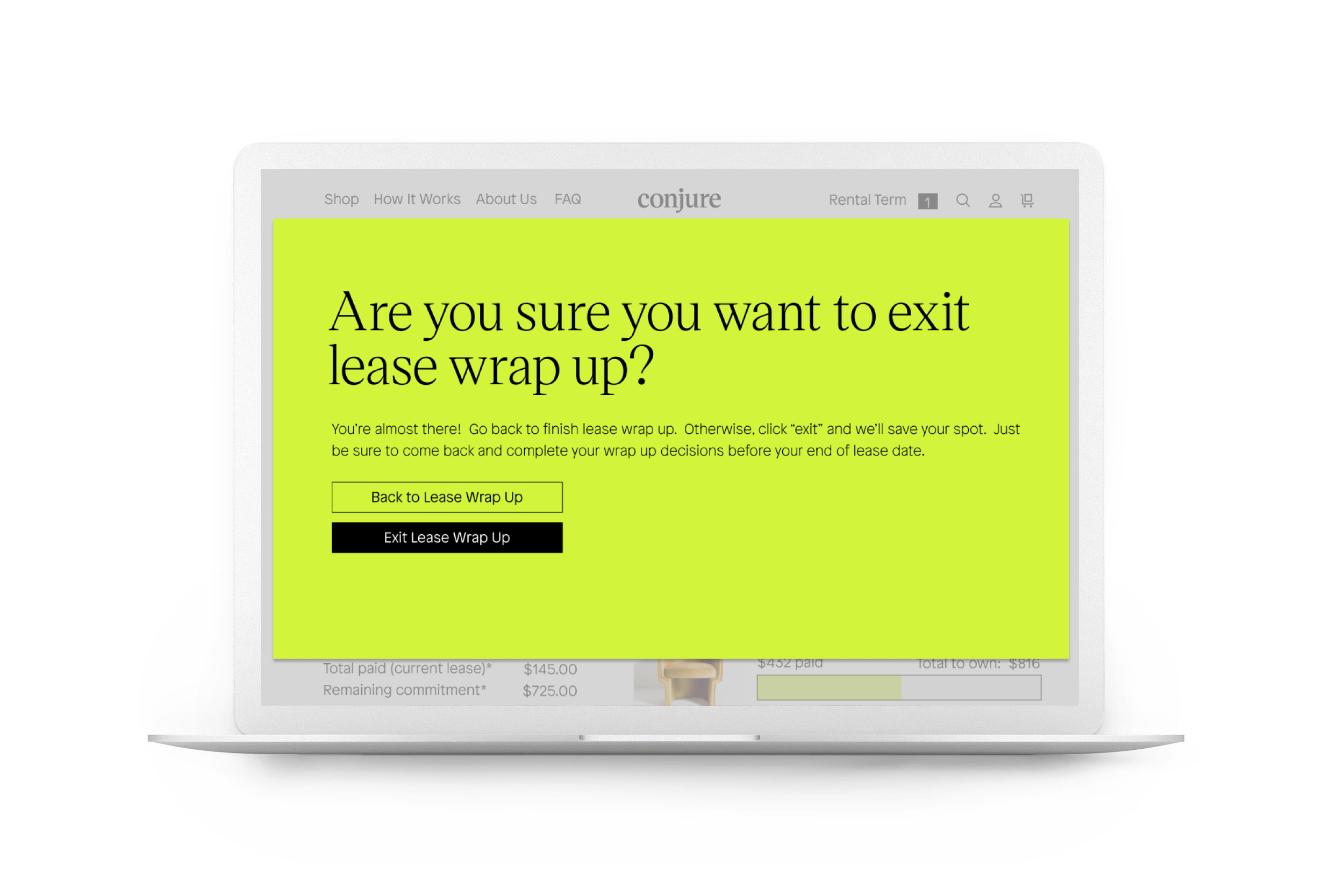
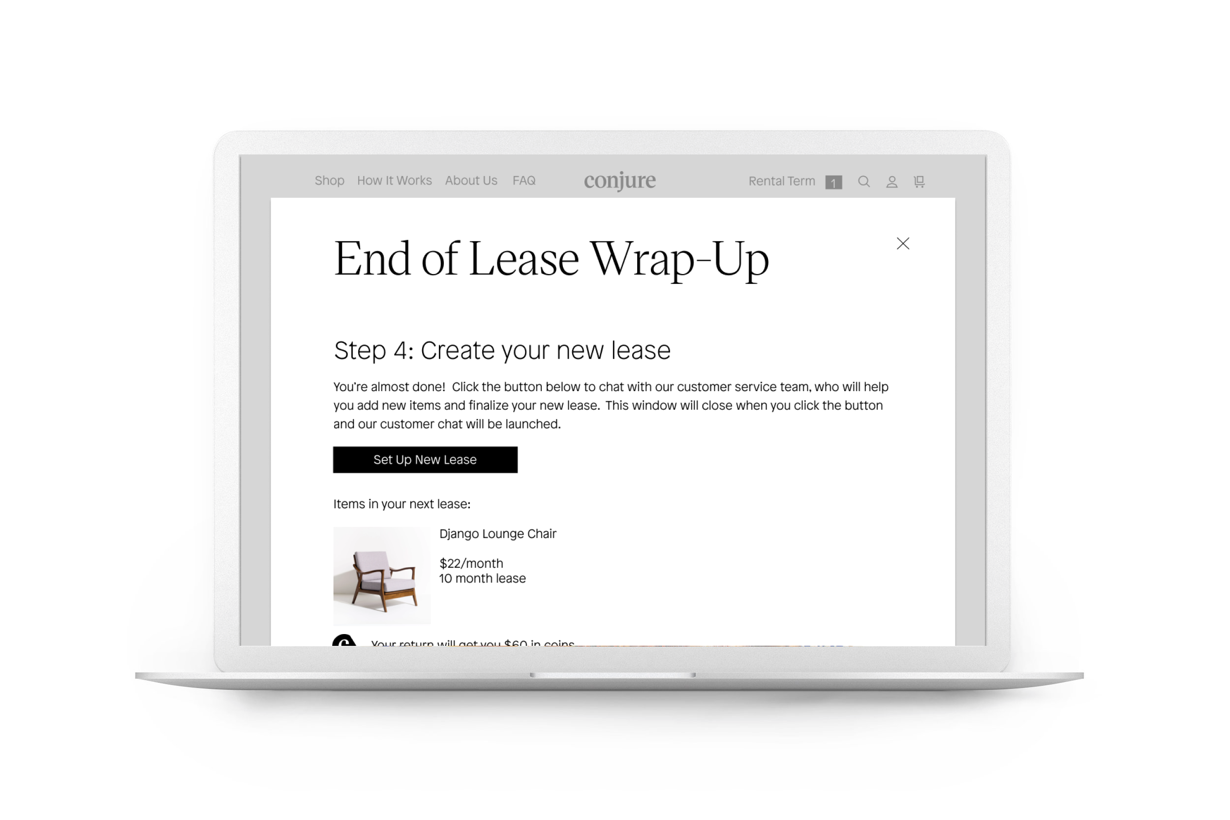
FIRST ITERATION:
In order to relieve the burden on CX as quickly as possible, we tabled some aspects of our ideal product for the next iteration, due to the heavy engineering lift required.
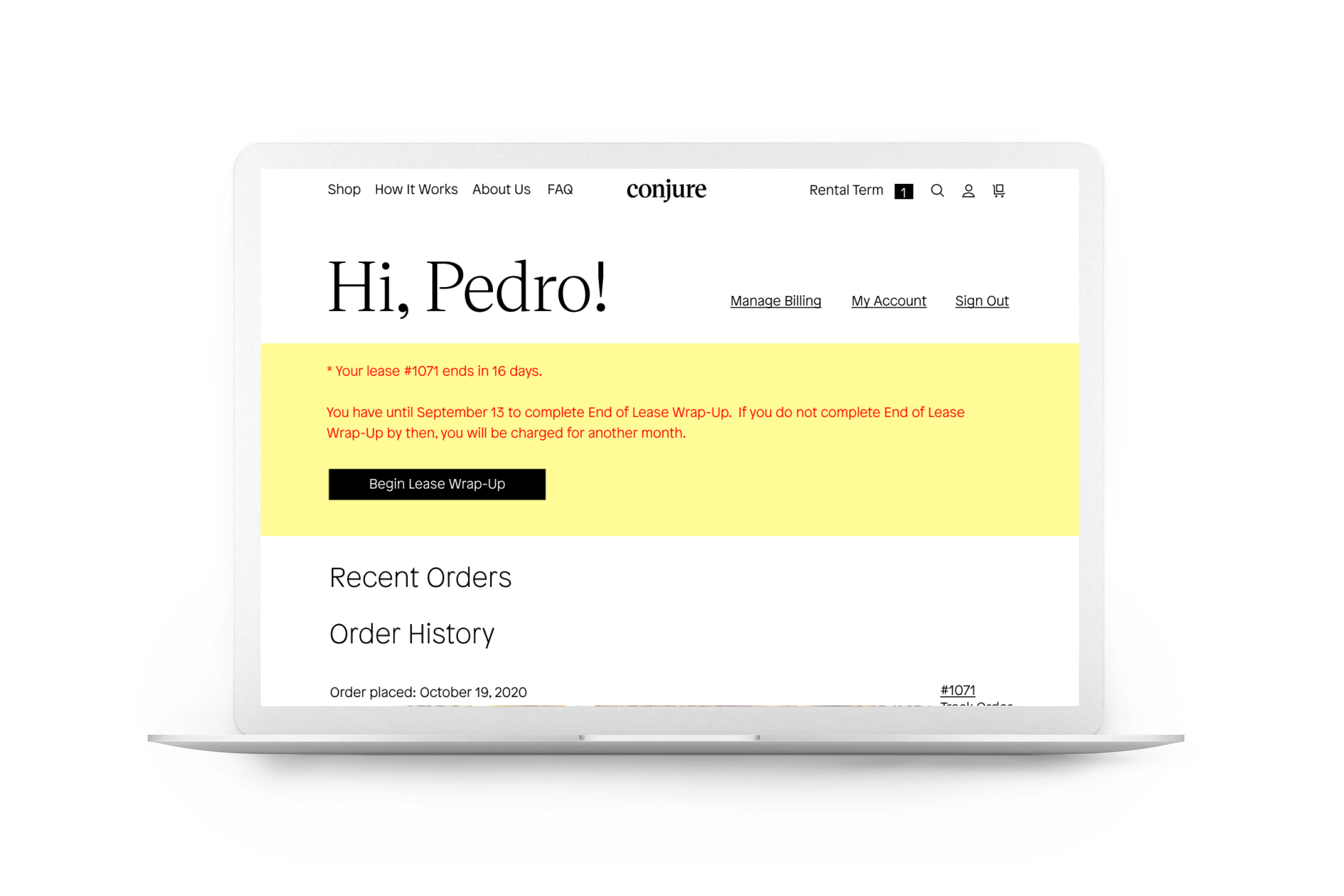
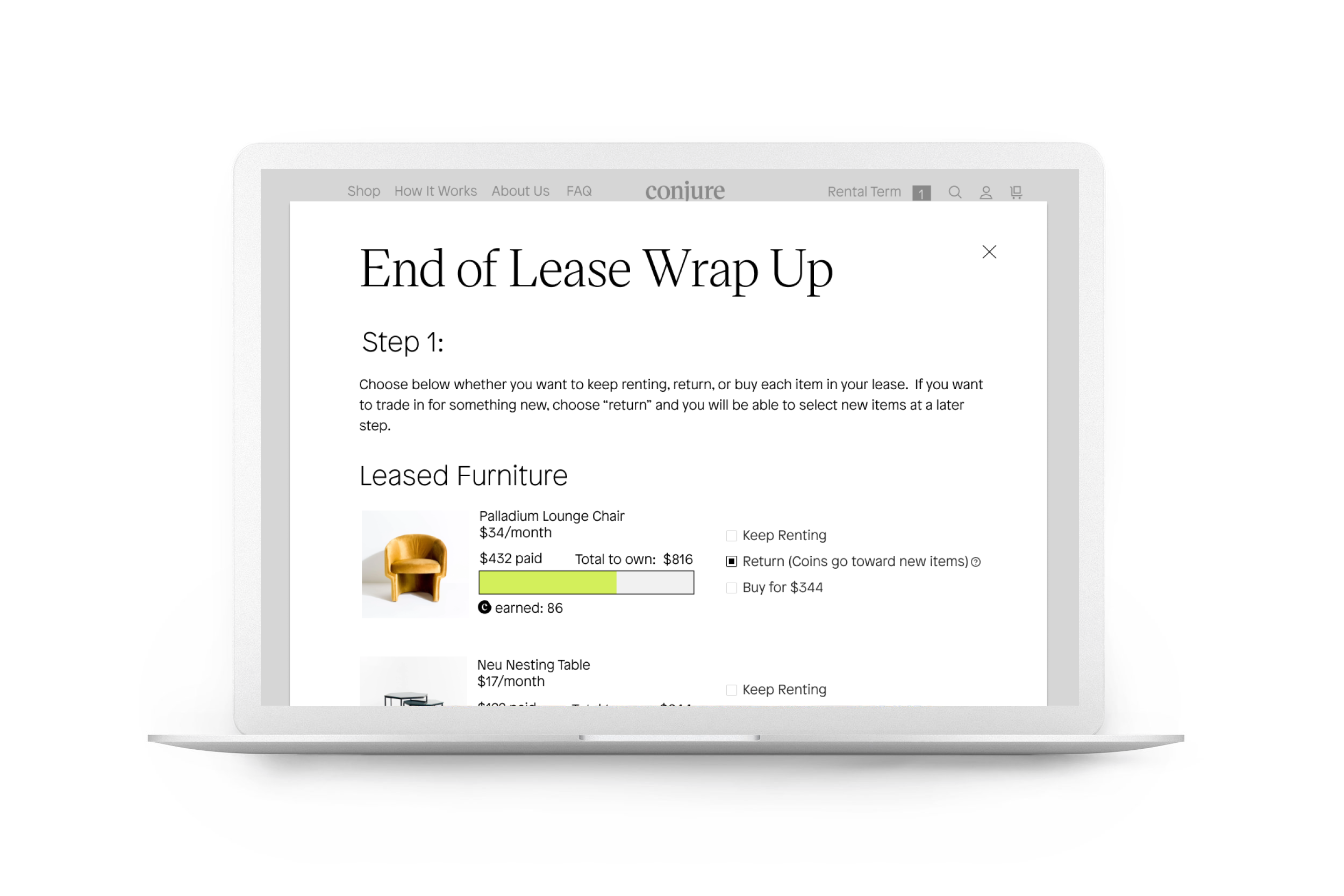
We landed on designs for the first iteration:
TESTING:
I conducted qualitative and quantitative user testing to gauge how well the product worked. It was a hard pass, as shown in below aggregated testing feedback.

I identified a handful of small pain points and opportunities from user testing journeys, as shown by sample individual customer journeys below.

REVISIONS:
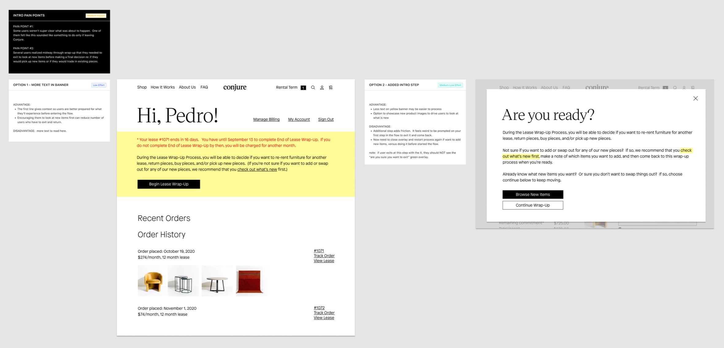
I identified areas to improve in short term versus longer term builds, based on the severity of the pain point and the engineering lift needed. I labeled proposed revisions with level of effort and level of impact to review with engineering and align on next steps to proceed with V2.
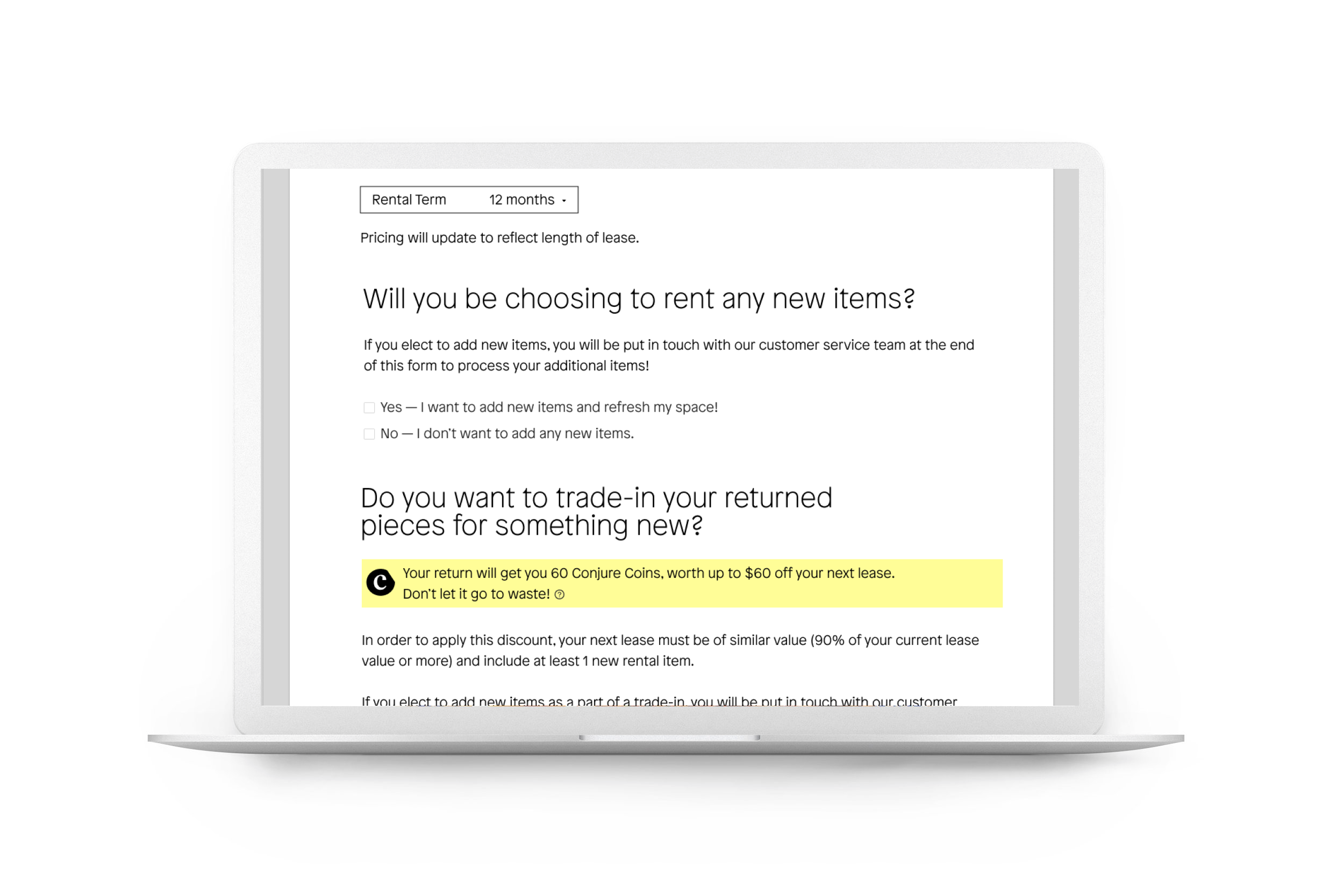
Key short term revisions included improved pricing transparency and improved ability for customers to understand the financial difference between decisions open to them in Step 1, as well as greater clarity at the start and the end of the flow regarding what would happen during and after wrap-up. Key long term revisions included ability to shop similar items mid-flow and pick out new items before confirming decisions being made on items from previous lease.
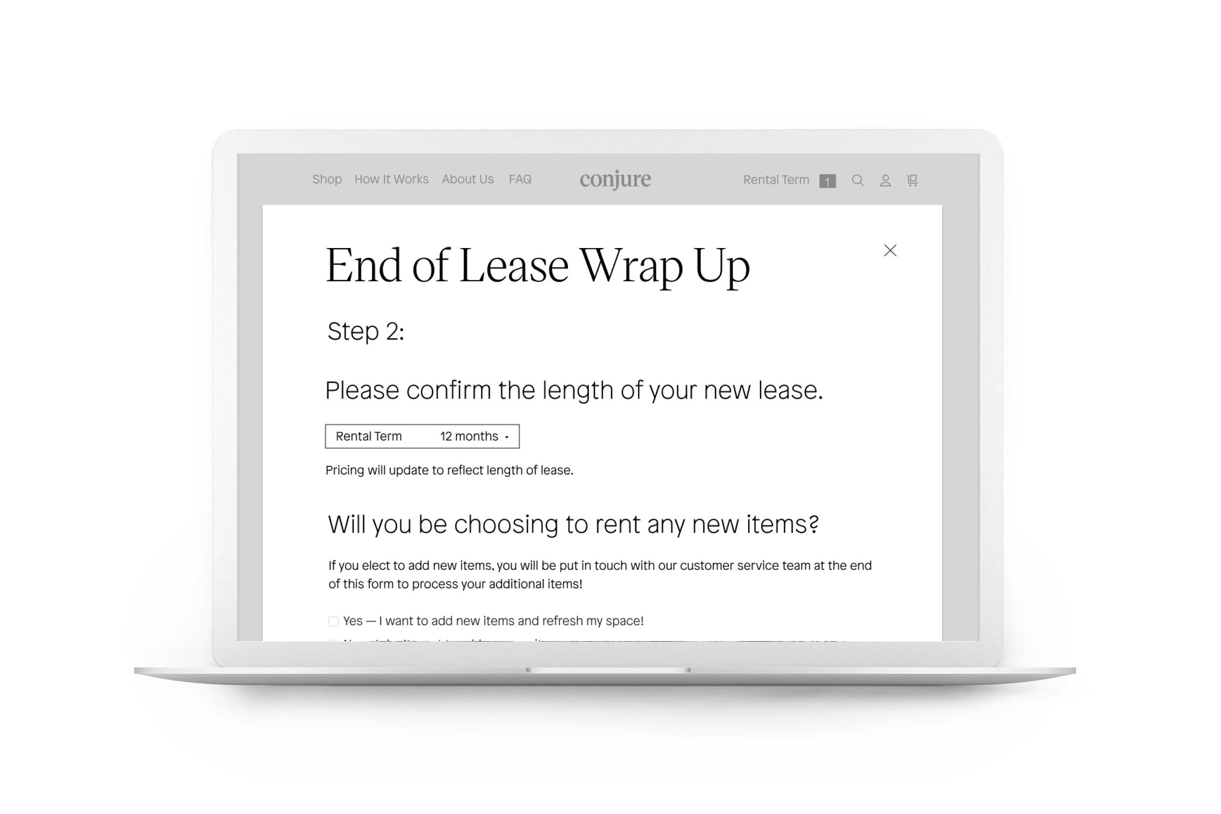
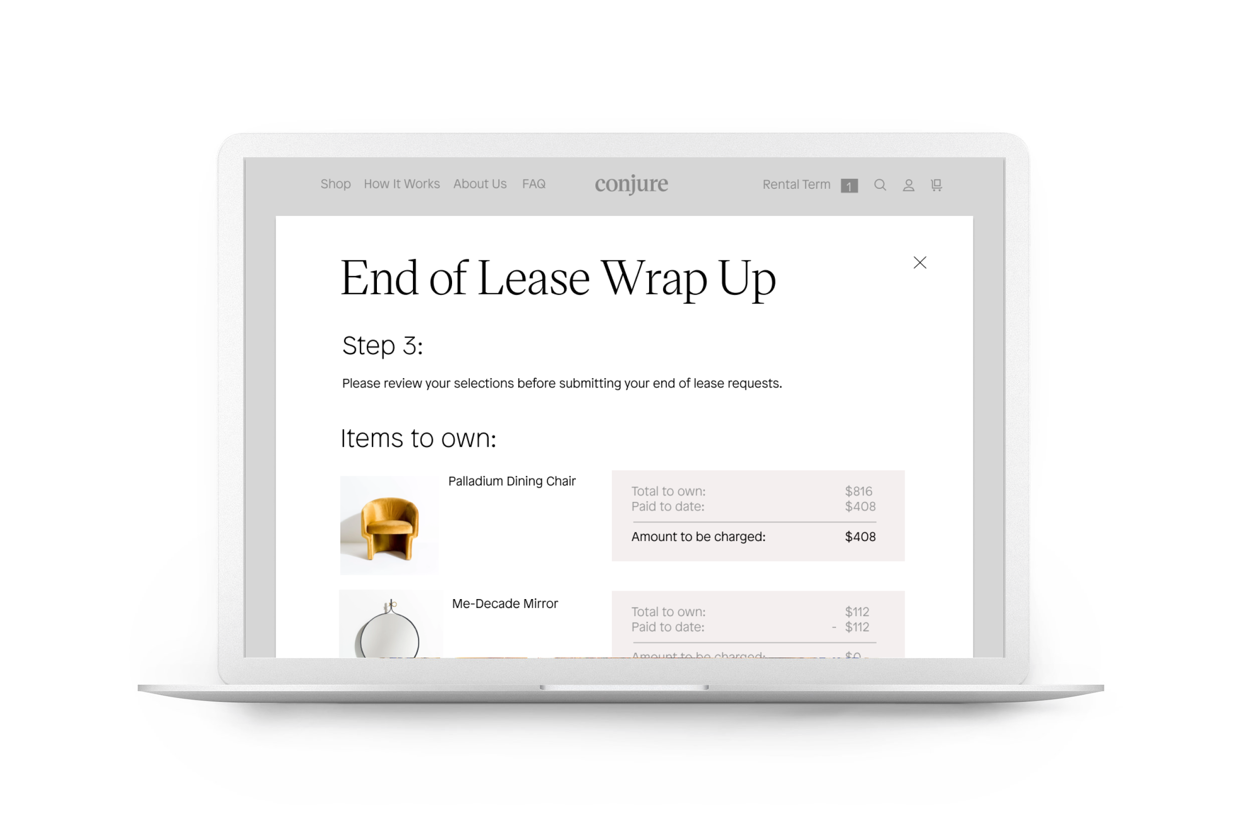
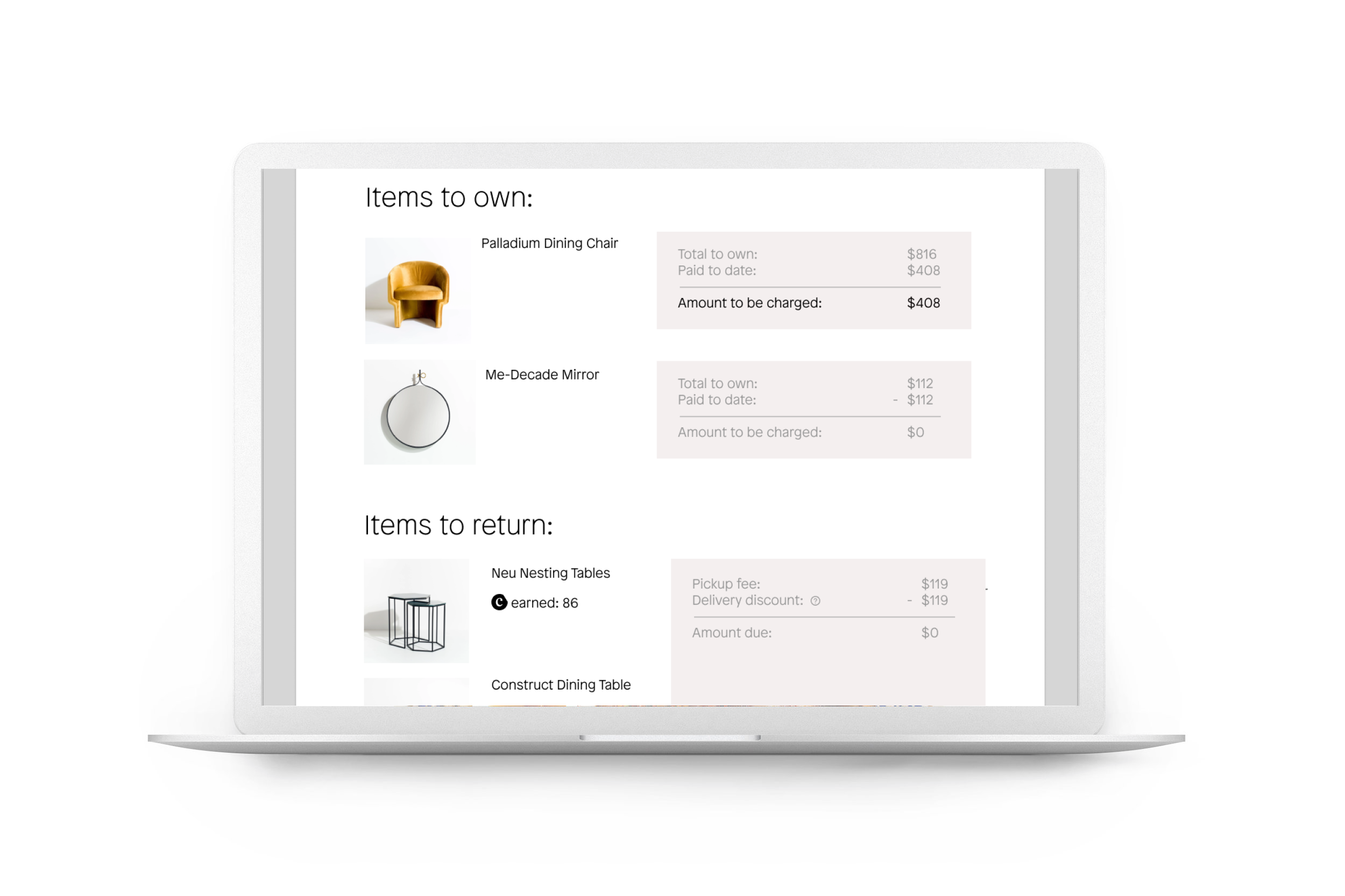
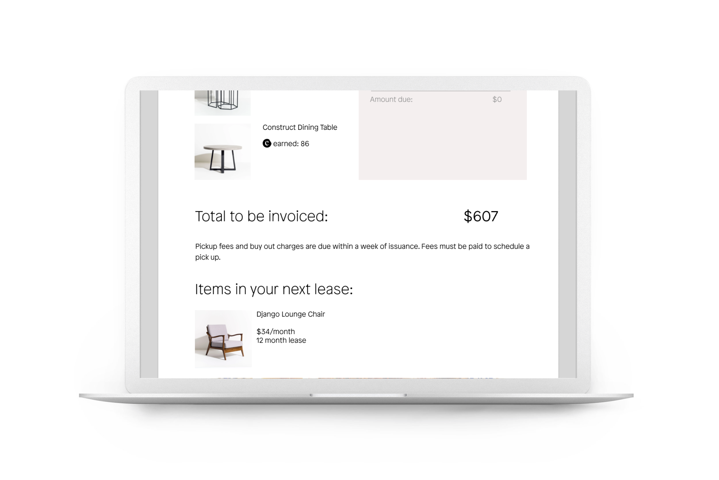
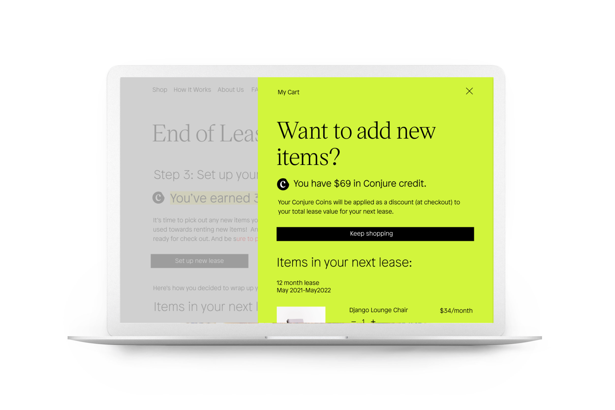
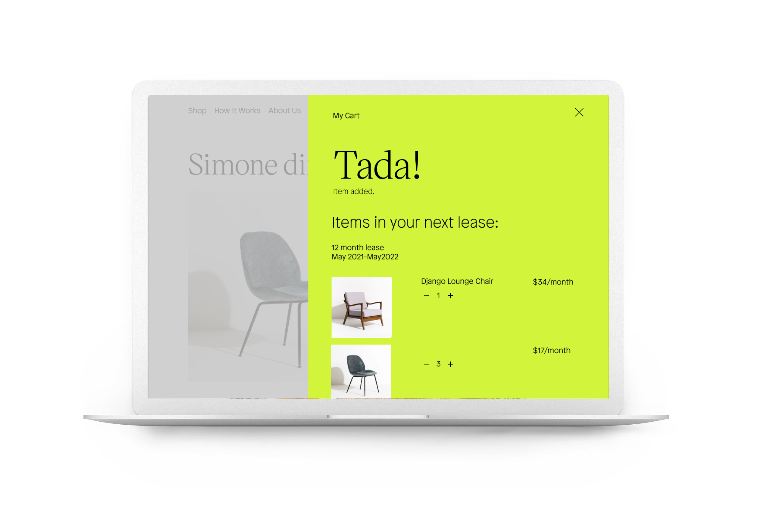
FINAL DESIGNS:
Below are some screens from V2 designs (showing user being able to add items to cart mid-flow) and shots of coordinating emails from the end of lease user flow.
LEARNINGS:
A key takeaway for me was the importance of looking qualitatively at individual customer journeys. While feedback on V1 of the product was overwhelmingly positive, there were small areas to improve that would have been lost if we had only reviewed quantitative feedback in aggregate. The spontaneous, story-telling nature of qualitative, one-on-one user research was invaluable to us not only in improving this specific product, but also in learning more about who our customers are, what they want from us, and where we can improve other areas of the business beyond the product in question.